DesignWeek: Wildish & Co. has designed the branding for plant-based nutritional yeast product Notorious Nooch
Notorious Nooch branding aims to reflect how vegans are eating today
The product and its branding are the brainchild of Wildish & Co design studio, and aims to bring the category’s branding “out of the 80s”.
Wildish & Co has designed the branding for its own plant-based nutritional yeast product Notorious Nooch.
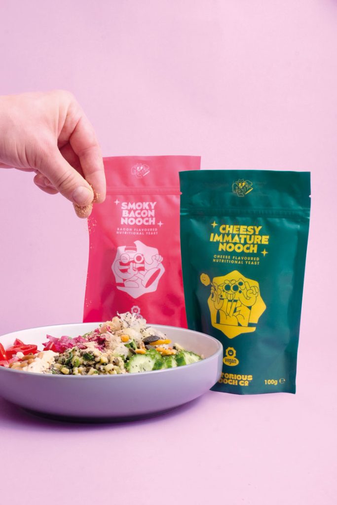
Nutritional yeast is a deactivated form of the raising agent, which offers a range of different vitamins and minerals when consumed. As an ingredient in vegan and plant-based food, it can be used to mimic the flavour of cheese.
It’s a product that has been on the market for some time, but has grown in popularity with the development of the vegan lifestyle movement.

“What if we made a product that reflected how people really used it?”
In the UK market, there is “only one real player” in the nutritional yeast market, says Wildish & Co co-founder Sam Fresco. But it’s a product that “hasn’t evolved in decades” he adds.
“After starting plant-based diets ourselves, we noticed that nutritional yeast – or Nooch – was used by the bucket load in recipes,” Fresco says.
However the packaging of the “major player” had not kept up with this usage, he explains. It advises people to stir one teaspoon of the flakes into water instead of using in recipes.
“We thought: ‘What if we took this product and created flavours? What if we made a product that reflected how people really used it?’” he says.

“A product that was cool, with a real personality and tone of voice”
The side project meant sourcing a complete supply chain for the product, as well as deciding on formulations for the different flavours. Additionally, Wildish & Co has done all the branding work for Notorious Nooch.
While nutritional yeast is traditionally found in health food shops and used as a vitamin supplement, more modern uses place it as an ingredient for vegan “junk food”. It was important then to ensure the brand stayed away from anything “medicinal” or “health food” related, Fresco says.
“As an approach, we were inspired by Minor Figures and Oatly, and how they had revolutionised the alt-dairy space,” he says. “Minor Figures especially really understood the less is more aspect, and how to make a product that was cool with a real personality and tone of voice.

“Fun, slightly nostalgic and a little bit hippie”
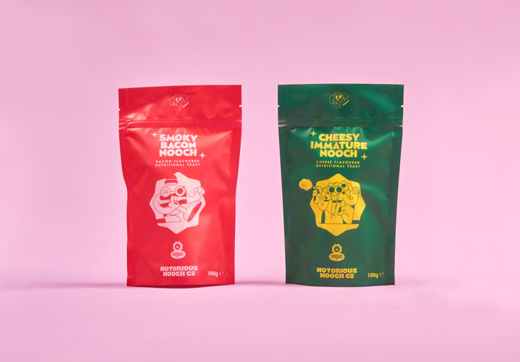
The team selected a “restricted core palette” that represented the two core flavours on offer – green and yellow for cheese, and red and pink for bacon. Fresco explains that as the brand grows, so too will the colour palette.
“The colours are bold and eye-catching, designed to show up online and on-package as highly impactful, easily readable and memorable,” he adds.
As for the typography, Fresco says this was selected for its “curvature and uniqueness”. “They were fonts we hadn’t seen often used, let alone in the food space,” he says.
“We wanted fonts that were fun, slightly nostalgic and a little bit hippie – leaning into the connotations of nutritional yeast and a vegan product line,” Fresco says.

“They do what we can’t”
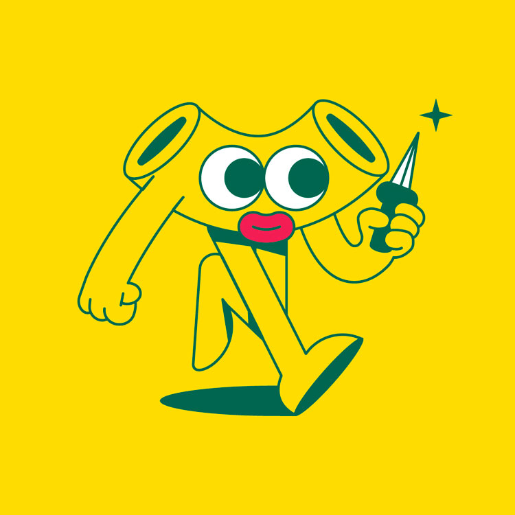
Illustrations and iconography are used to create a branding with “fun and imagination” at its core, Fresco says. “They instantly give the brand personality and soul, plus they help us get around calling a product cheese or bacon, without having cheese or bacon in,” he explains. “They do what we can’t, in a show don’t tell way.”
The characters found on the packaging also help bring a “tone of irreverence” to the branding, the designer adds. The characters also act as a “playful graphic device” which can be extrapolated for social media or other brand communications.
“We’ve started using our illustrations to ‘rate’ other people’s dishes for example, always in a wry and unimpressed tone, and it’s going down super well,” he says.

This is too many words. I would like to leave
↙ Back to ThoughtsThe 12 Best Creative Agencies Every Brand Should Know in 2025
The 12 Best Creative Agencies Every Brand Should Know in 2025 Finding the right creative agency can make or break a brand. The best agencies do more than deliver visuals—they translate ambition into clarity, tell stories that stick, and create work that resonates in a crowded world. But the challenge? There are thousands of studios … The 12 Best Creative Agencies Every Brand Should Know in 2025
Good rebrands start in Figma. Great ones start in the room.
When brands come to us asking for a new rebrand, they typically want a brand mark, colour palette, typography and motion design, as well as a handful of marketing templates. What we give them is a 3-4 month collaboration that involves a lot of upfront groundwork: talking, research, thinking, asking and listening. When we meet … Good rebrands start in Figma. Great ones start in the room.