Retro rebrands: why so many brands are embracing nostalgia
Every year we see a handful of big name companies going through the process of rebranding with a branding agency. It’s always a tricky field to navigate, but it can be a necessary one for ensuring your business stays current and relevant, without losing the strong connections your customers already have with your visual identity.
In recent years, we’ve seen a rise of rebrands that are embracing older versions of their logos and bringing them back with a 21st century twist. With retro colours, styling, and fonts, they’re providing a sense of nostalgia for those that remember the previous branding, while still offering a fresh take for younger customers.
Here are some of our favourites.
Burger King
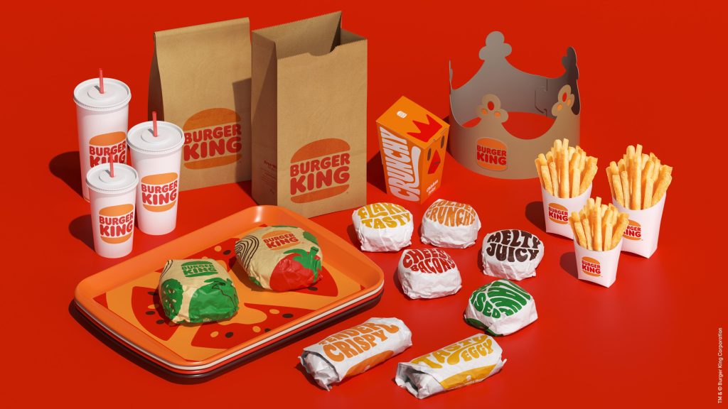
One of the most-talked-about rebrands in recent years, Burger King made headlines by taking its visual identity back to “when it looked it’s best”.
The new logo is a streamlined version of the original one from 1969, playing homage to its iconic heritage. Using a simple but very clever design, Burger King have created a brand that is “mouth-watering, big and bold, playfully irreverent and proudly true”.
Aligning with the logo used throughout the 1970s, 80s and 90s, the new branding features warmer colours including deep brown, orange, red and green – a distinctively “retro” palette. This, alongside the custom font and all the digital assets creates a real sense of nostalgia for the vintage fast food experience.
Our favourite aspect of the Burger King rebrand has to be the BK monogram. Cleverly shaping the letters B and K into a burger shape is such a simple but effective use of design. We’re impressed.
Kodak
![]()
For the first time in a decade, Kodak refreshed its identity with a retro-inspired logo. Taking inspiration from the iconic “Kodak K” first introduced in 1971, the company brought back a similar logo using the red K symbol against a yellow background.
The new logo is respectful to the legacy of the brand, with its designers careful to honour the science and creative vision of Kodak. It’s not exactly the same as the visual identity people may remember from the 1970s and 80s, instead it utilises a more contemporary font that brings it straight back into the 21st century.
The decision to bring back the “Kodak K” was validated when the company carried out its brand recognition research, which revealed a staggering 58% of respondents could recognise the brand from the outline of the logo alone – proving that sometimes, the oldies really are the goodies.
Co-op
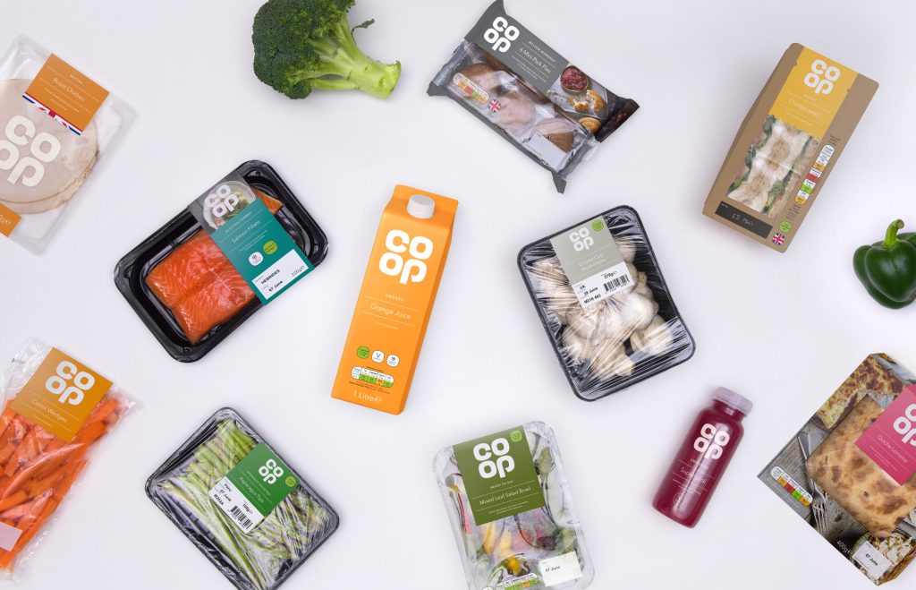
As part of a £1.3bn investment to breathe fresh life into the 172-year-old business, The Co-operative Group returned to its classic 60s look in an exciting rebrand.
The facelift included major changes to its food shops and funeral homes, a radical shake-up of the board, as well as improved products and services. The big change that we were most excited about though, was the revival of the 1968 cloverleaf logo.
The logo was redrawn from archive material with a new colour scheme introduced to enhance the original Co-op colours and breathe new life into the revived branding. Alongside this, a new typeface was also included in the rebrand to work across all print, digital and in-store touch points.
After a few years of scandal and disruption, the Co-op needed to make some changes to improve its tarnishing image. The new logo was designed to bring with it a sense of familiarity to long-term customers, providing a much-needed sense of stability and a deeper connection with the company’s long history.
We think it worked.
NatWest
Another company who looked to the past for their rebrand inspiration was NatWest, who also delved into its 1968 archives to produce a new logo based on the original icon.
The new visual identity includes a “vibrant and optimistic” colour palette including purple, pink, teal and yellow. The logo, however, remains the iconic red that customers have come to recognise as NatWest.
With its bright colours and animated elements, the new branding feels more parallel to the designs of digital banking start-ups like Monzo or Starling, rather than a traditional, stuffy high-street bank.
Tying in the new contemporary look and feel with its retro logo is the perfect marriage of old and new to suit both long-standing customers and new ones.
As we’ve seen, reviving old logos from bygones past and tweaking them to fit a 21st century audience is clearly on a lot of designers’ minds at the moment, especially when rebranding household companies that have really stood the test of time.
The ability to create a sense of nostalgia and familiarity for your long term customers, while remaining fresh and contemporary for a younger generation is a great way to build on the legacy of your brand, and it’s no wonder we’re seeing such a retro reboot lately.
Don’t get us wrong, there are definitely a few logos that should remain firmly in the past, but if you could bring back an iconic old logo from history, which would it be? We’d love to hear your ideas.
This is too many words. I would like to leave
↙ Back to ThoughtsThe 12 Best Creative Agencies Every Brand Should Know in 2025
The 12 Best Creative Agencies Every Brand Should Know in 2025 Finding the right creative agency can make or break a brand. The best agencies do more than deliver visuals—they translate ambition into clarity, tell stories that stick, and create work that resonates in a crowded world. But the challenge? There are thousands of studios … The 12 Best Creative Agencies Every Brand Should Know in 2025
Good rebrands start in Figma. Great ones start in the room.
When brands come to us asking for a new rebrand, they typically want a brand mark, colour palette, typography and motion design, as well as a handful of marketing templates. What we give them is a 3-4 month collaboration that involves a lot of upfront groundwork: talking, research, thinking, asking and listening. When we meet … Good rebrands start in Figma. Great ones start in the room.